Yesterday, while creating a Moodboard Midjourney profile based on images, I noticed a few key insights that I’d like to share with you. If you’re experimenting with profile training, these observations might help you achieve more predictable and satisfying results.
How does the level of stylization affect the recreation of the style on which the model is trained
1. More Images = Less Predictable Results
The more images you upload to train a profile, the less predictable the outcomes tend to be, especially if the images vary significantly in background and framing.
2. Dominance of Training Subjects in Final Images
One intriguing discovery is that the object or subject most prevalent in your training dataset tends to dominate the generated images. I’ll explain more about this shortly.
3. Impact of the --stylize Parameter
Finally, I observed that the --stylize parameter plays a crucial role in the output’s style and fidelity. Let’s break this down with some examples.
Testing Profiles: Examples and Lessons Learned
Experiment 1: Training with 32 Mixed Images
For my first test, I uploaded 32 images I found online, including both photos and 3D renders, to create a profile. Then, I generated a simple prompt:
/imagine prompt cat --profile
Result: The outputs were inconsistent. Initially, MidJourney created four photographic images. Then, the next set included one photograph, two 3D renders, and one illustration.
Conclusion: The issue likely stemmed from the training set’s diversity. The images were too different in style, framing, and content to create a cohesive output.
Experiment 2: Focused Training with 18 Images
For my second profile, I selected 18 curated images: 16 of cozy houses and 2 of characters.
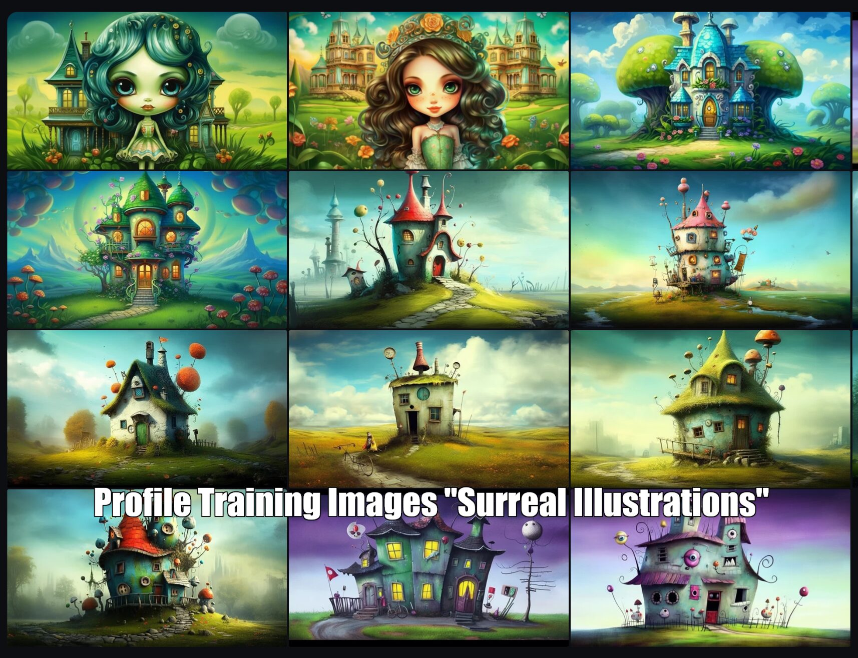
Result:
The outputs had a cohesive style I loved. However, 90% of the generated illustrations prominently featured houses, even when they weren’t explicitly mentioned in the prompt. To mitigate this, I had to use negative prompts like --no house. Occasionally, objects would appear with eyes, requiring additional negative prompts such as --no creature, eyes.
Reflection:
Despite these challenges, the surreal, whimsical style of the illustrations was delightful. I named this profile “Surreal Illustrations”.
Experiment 3: Expanding Object Variety
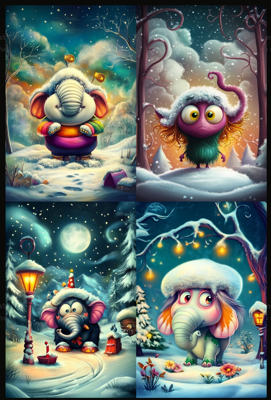
Next, I created a profile called “Surreal Book” using 17 images based on “Surreal Illustrations”. This time, I included a wider range of subjects: characters, buildings, vehicles, birds, animals, objects, scenes, and anthropomorphic creatures.
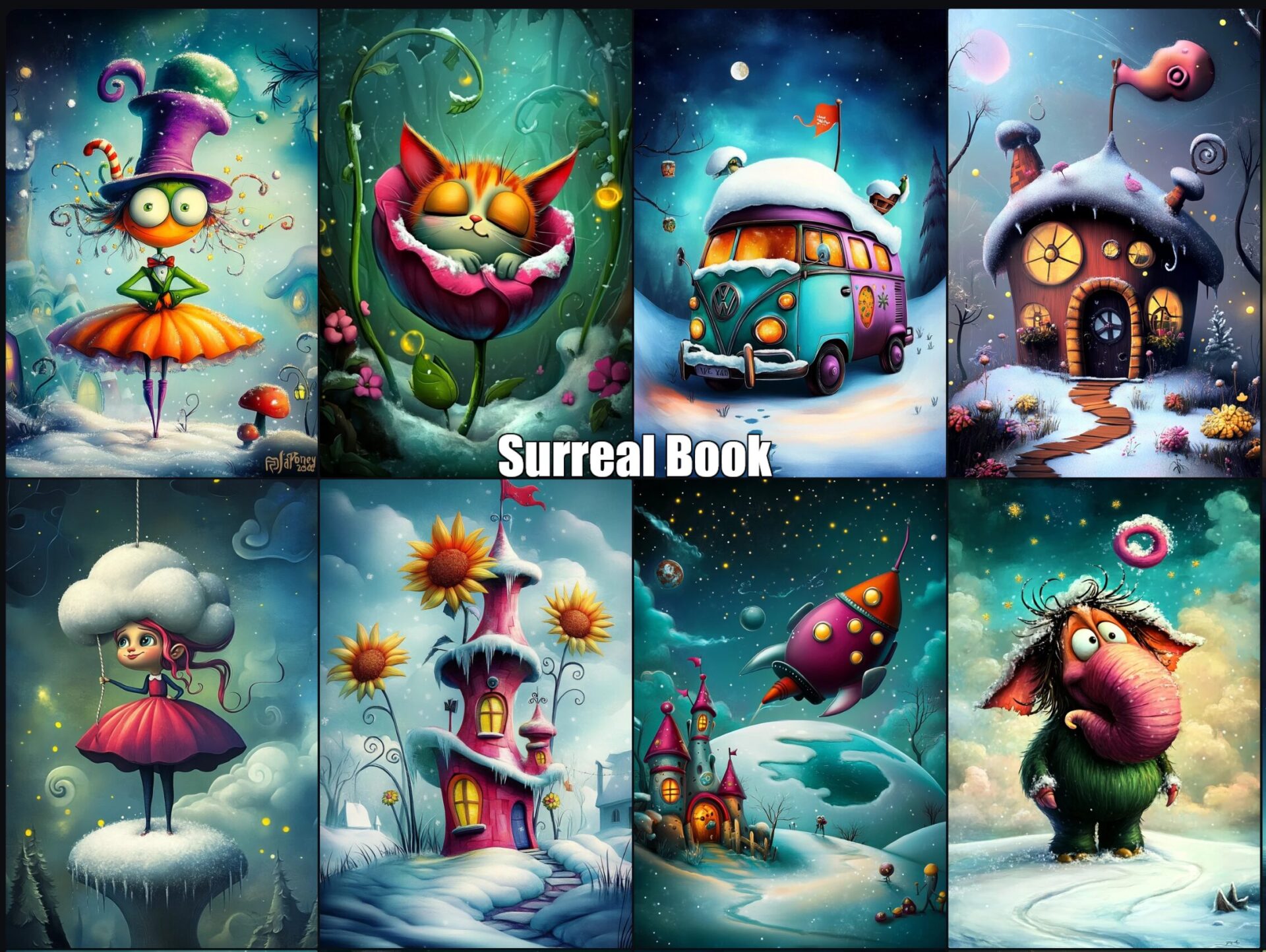
Result: The style remained consistent, but the details improved. For example, a mammoth looked more like a mammoth rather than a strange, abstract form.
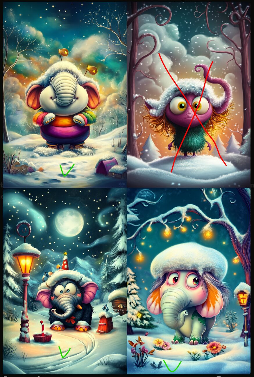
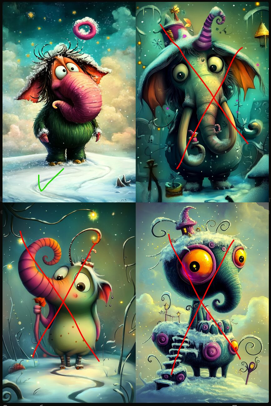
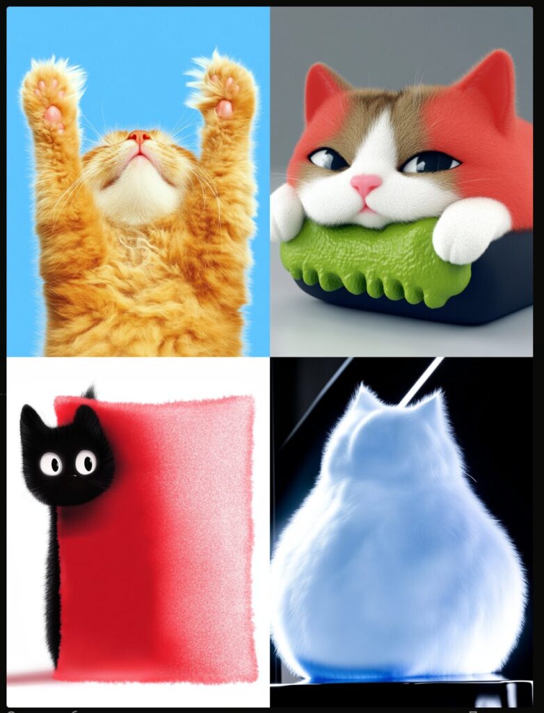
Exploring the --stylize Parameter
Curious about the influence of the --stylize setting, I generated images with varying values:
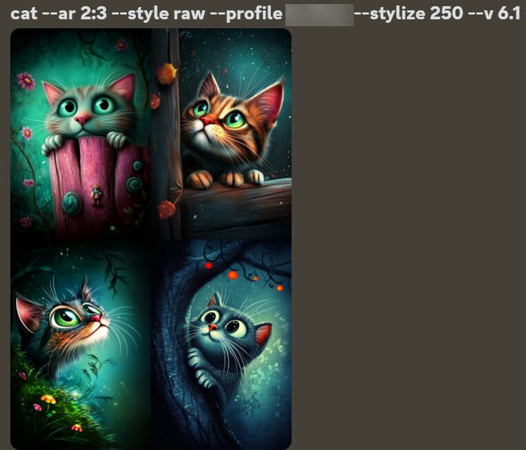
- Stylize at 250 (the default for my earlier experiments): Outputs retained the trained profile’s surreal style.
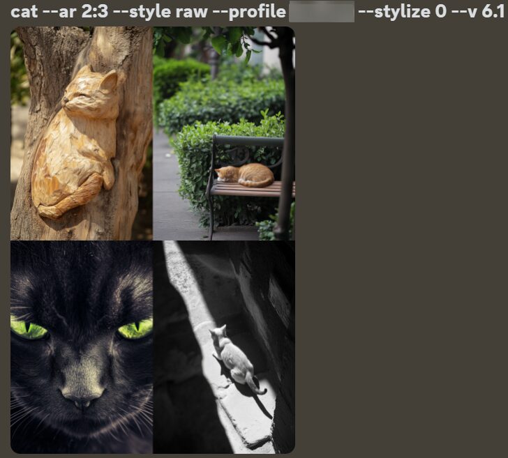
- Stylize at 0: Outputs deviated significantly from the training profile’s style.
Here’s a comparison of the same prompt with and without stylization:
cat –ar 2:3 –style raw –profile ***** –stylize 0 –v 6.1 and cat –ar 2:3 –style raw –profile ***** –stylize 250 –v 6.1
Experiment 4: Combining Profiles
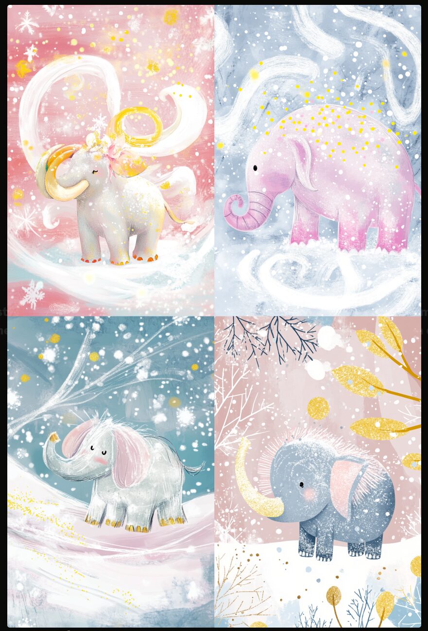
Finally, I created a new profile called “Surreal World” using 23 images derived from the two previous profiles. This time, I tested prompts with --stylize 0 and compared them to those with higher values.
Result:
When --stylize was set to 250, the profile’s style was apparent. At 0, the results lacked the cohesive surreal style, which left me puzzled.
Key Takeaways and Questions
The inconsistency in style raises some questions:
- Shouldn’t the images generated reflect the trained profile’s style regardless of the prompt or stylization level?
- Is the prompt itself influencing the style more than expected?
What are your thoughts? Share your experiences and tips in the comments—I’d love to hear them!